The Modus Create blog
Join 2000+ innovation leaders and get monthly insights about digital product engineering and modernization.
Our takes are strong. They come from the hard-earned knowledge of building real-world software and platforms, not just theory. No matter what you’re aiming to build next, our blog offers guidance forged from years of hands-on, results-driven experience.
Use left and right arrow keys to navigate slides. Slide 1 of 3.


Business Leadership
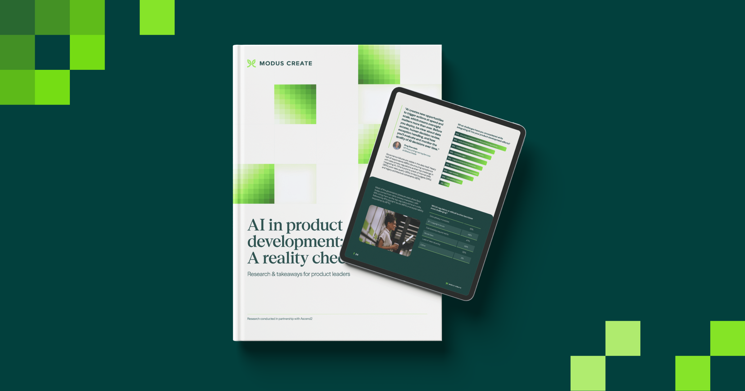
Rushing AI, missing ROI: Modus Create study of 500+ leaders reveals what’s slowing product innovation
Modus Create’s new study of 500+ leaders reveals how AI is reshaping product development, exposing gaps in ROI readiness, governance, modernization, and team structure.
Read moreLatest articles from the Modus team
Loading...
LET'S GET STARTED
Talk to Modus Create
Big challenges need bold partners. Let’s talk about where you want to go — and start building the path to get there.