Bright MLS – Creating a UX Obsessed Culture
Bright MLS challenged us to bolster revenue by launching new premium products and reduce customer support calls through a simplified user experience. Plus, Bright was in the midst of a merger — we needed to serve two user bases accustomed to different tools.

Table of contents
Subscribe via Email
Subscribe to our blog to get insights sent directly to your inbox.
Modus Create’s UX Work Involved
- Developing user personas
- User journey mapping
- UX Design workshops
- Rapid prototyping and lean validation
- On-field user analysis
- Product onboarding
- Phased release management
- New navigation process
Modus Create’s Business Impact
- Increase in revenue
- Better understanding of customers
- Seamless merger experience
- Reduction in customer support calls
Cost Savings – $600,000
- How does Modus Create increase revenue with digital products?
- How does Modus Create reduce customer support calls?
- How does Modus Create bring consistency to the product portfolio?
- How does Modus Create merge two different customer bases?
Bright MLS got in touch with Modus Create to find solutions to each of these problems. On the surface, the problems seem unrelated as they involve different departments. Our consultants realized that UX (User Experience) held the key to solving all four problems.
After being burned in the past, Bright’s board of directors had come to doubt the value of user experience work. However, we aimed to rekindle their belief in UX as a competitive advantage.
Solving One of the Most Pervasive Issues in Real Estate
Imagine you’re a new realtor working with your first client who built their fondest memories in the home you want to sell. And now you have to convince them that their home is worth $20k less than they think. You have very little data to back up your pricing decision.

This is a common issue faced by real estate agents. Bright wanted to solve it using a new app. Modus Create partnered with their team and worked on the following deliverables:
- Identifying the North Star – Running a goals session to brainstorm and prioritize KPIs. The focus was on product adoption and agent close rate, so the primary success metric became the number of product subscriptions.
- Developing user personas – Bright’s internal knowledge of customers helped in developing provisional user personas. We later used insights from field studies and customer interviews to iterate on these personas and make them evidence-based.
- Mapping user journey – Mapping out the users’ current user experience by paying particular attention to cross-channel experiences and pain points. This was followed by brainstorming ways to fix the pain points. These ideas evolved into a product roadmap.
- Organizing UX design workshops – Organizing a series of UX design workshops with Bright MLS to sketch out UI flows and pick the most promising ones for prototyping.
- Rapid prototyping and lean validation – Creating interactive prototypes to validate the product idea and sharing these with actual realtors. We fed learnings back into the design process and continuously iterated on the designs.
This led to the creation of a brand new digital product – Listing Insights.
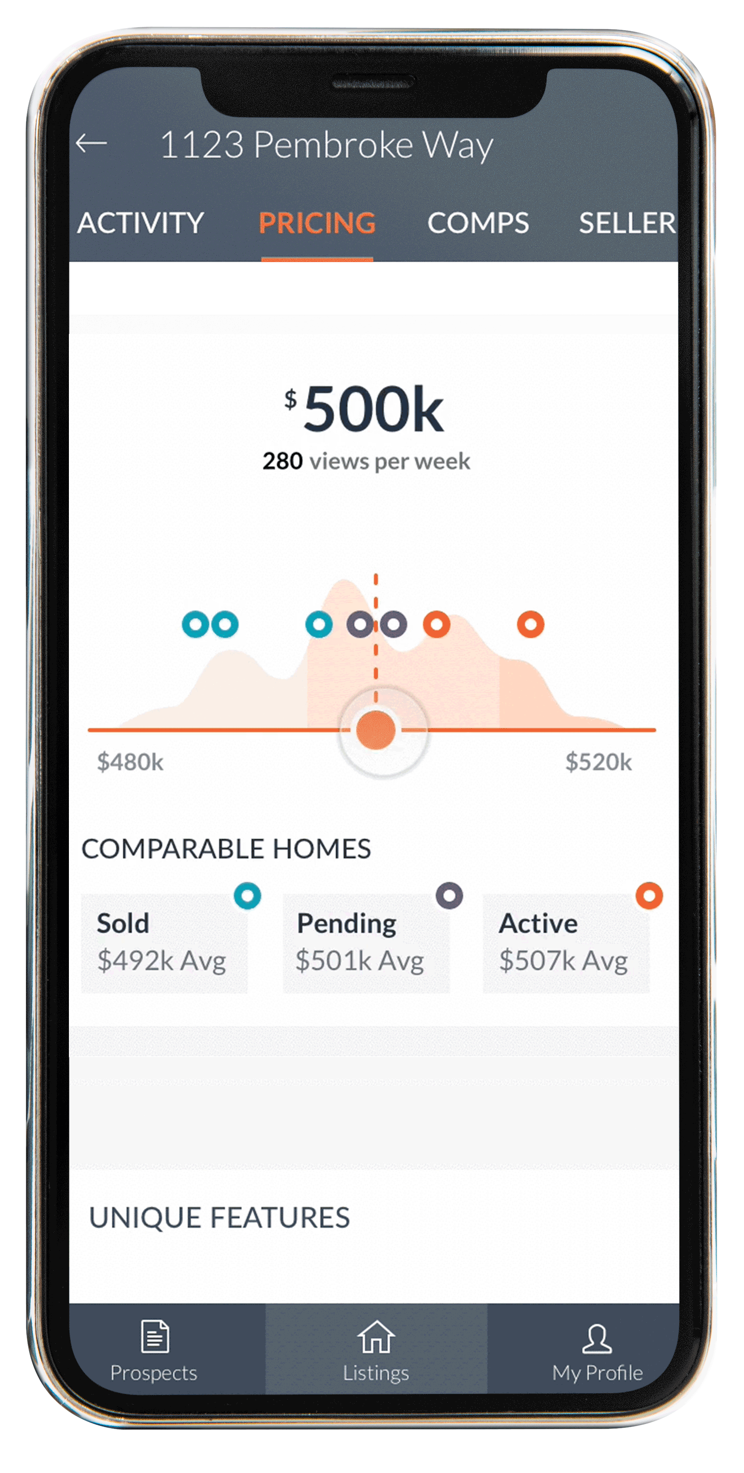
How are comparable homes priced? Which price ranges are most popular for house hunters in this area? Listing Insights helps realtors justify their pricing decisions with real-time market data.
Once realtors publish the listing, they can track how well it’s doing – from unique views to shares and favorites.
Realtors can now use data to compare list prices, time on the market, and backup their pricing decisions. With advanced analytics, they know how well listings are performing and show prospective clients their proven track record.
Reducing Customer Support Calls
Bright MLS’s customer support team was flooded with hundreds of UX-focused calls every day. Modus set out to cut that number in half by creating a user experience that required no explanation.
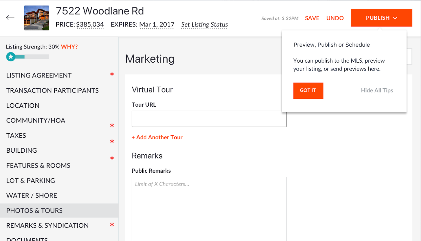
The first step was understanding the problem. Why were customers calling so often? What were the most common issues? There was no better way to answer this question than to dive into the customer support logs. They revealed that Bright’s realtors were consistently confused about the intricate process of publishing a listing. They all asked the same questions: how do I reuse listings? Why can’t I change the status of a listing? How do I schedule a showing?
The source of confusion for realtors was a specific tool by Bright that was used for publishing listings to the web.
After realizing this, we shadowed realtors as they went through the process of publishing a listing. Observing realtors at work allowed us to focus on what they actually do, rather than what they say they do.
Bright’s form for creating a listing had over 400 fields. Each of those fields could dynamically appear and disappear based on over 7,000 business rules. Most realtors ignored a majority of the fields when creating a listing. They attempted to jump between the required fields, which meant they inevitably missed fields that were not required but were still valuable.
Analytics revealed which fields were most valuable to realtors and consumers. The graph theory shed light on the complex relationships between each of these fields. To prevent new challenges for customers, realtors were asked to use the prototypes. This allowed us to discover and fix issues before sending the prototype to development.
In the end, the process significantly reduced the no. of calls for Bright’s customer support team.
Bringing Consistency to Bright MLS’s Product Portfolio
Bright MLS had a large portfolio of digital products, many of which were owned by third-party vendors. Nearly every product looked and felt different – from colors and typography to workflows and front-end frameworks.
The first step in bringing consistency was mapping out the different products in Bright’s arsenal and understanding the data flow between them.
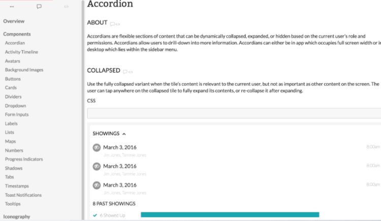
Over the lifecycle of designing and building 4 different digital products for Bright, Modus Create evolved a design system documenting reusable UI components.

Finding the Best of Both Worlds in a Merger
Bright MLS wished to merge two customer bases that were used to vastly different user experiences. This can be a tricky problem to solve because forcing behavioral changes without proper planning is often met with resistance.
Based on the industry best practices, discussions with Bright’s leadership team, and our previous client experience, Modus decided to take the following steps to align the user experience of both customer bases:
- New navigation – Bright’s existing navigation featured proprietary product names, such as Keystone and Listing Insights. This was great for marketing, but hard to understand for new users. To fix this issue, we ran card sorting sessions with real estate agents to define and sort task-centric labels. The navigation was tested with novice and experienced users from each company.
- Onboarding– Pairing new features and enhancements with simple onboarding flows that explained how the user experience had changed.
- Phased release – Working with Bright’s product management team to avoid abrupt, large-scale disruption to UX by phased releases of new features and enhancements.
The three-step approach ensured a smooth merger of the two customer bases by creating an intuitive experience.

UX Impact on Business
What makes UX such a game changer is its ability to affect the two most critical aspects of any business – cost and revenue.
Bright MLS saved $600,000 by reducing the customer support calls due to upgraded UX. The new intuitive UI allowed Bright’s users to figure out the process of listing themselves rather than contacting Bright’s customer support.

Bright also experienced higher revenue with new dynamic products such as Listing Insights which now helps realtors justify their pricing decisions with real time market data.
But perhaps the most vital impact of the Modus Create-Bright MLS engagement was fostering a UX obsessed culture in the organization. In the words of Bright’s VP of Product Innovation, Andrew Strauch, “For the first time, we’ve been able to successfully make the case to our board that UX matters.” With leadership that’s energized by the impact of UX on the business, Bright is poised to drive more powerful outcomes in the future.
Modus Create’s work with Bright MLS showcases the potential of user experience to make a strategic impact on business. If you’d like to explore how UX can elevate your business, let’s talk.
Related Customer Stories
Discover more customer stories.


