Create legacy,
not legacy tech
Innovation stalls when companies stack tomorrow’s technologies on yesterday’s habits. Modus Create helps you change both the systems and the workflows around them so technology investments deliver real business outcomes.
SOLUTIONS
What is slowing you down?
The hardest part of modernization is knowing where to begin. We help you simplify your infrastructure, clear technical debt, and build a secure foundation.
Our product experts help you get out of pilot purgatory and build digital solutions that advance your vision and deliver real business gains.
Your AI initiatives are only as good as the quality of your data. Get clean, AI-ready data and deploy solutions aligned with business outcomes.
Help your teams adopt new technology with the right mix of guidance, workflow design, and engineering support.
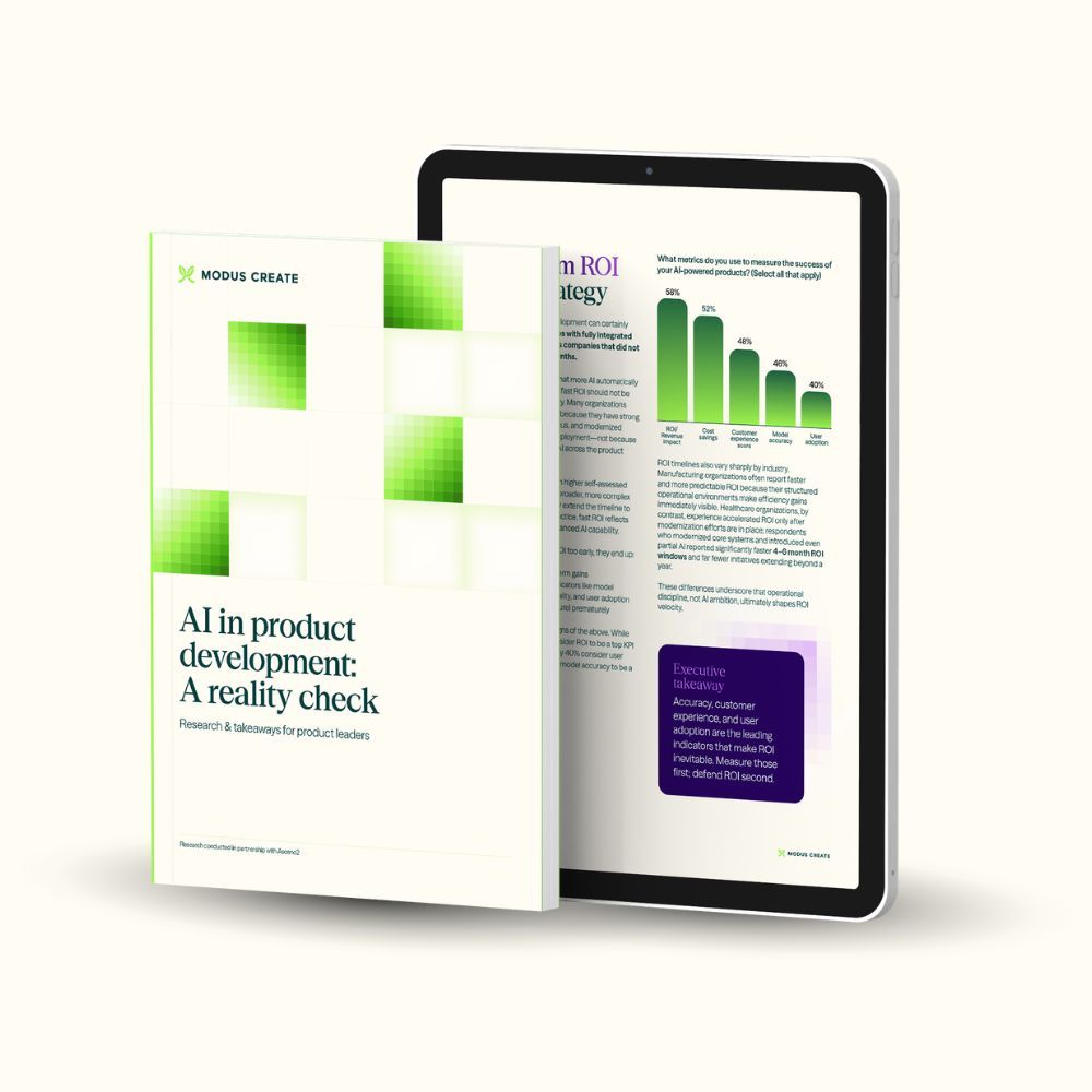
INSIGHTS FROM 550+ LEADERS
The AI reality check every product team needs
The leading study on AI in product development reveals rising ROI pressure, a growing strategy–delivery gap, and governance slowing progress. Get the report for insights on:
- Key drivers of AI ROI
- The underestimated AI maturity gap
- AI’s impact on the strategy–delivery divide
- How governance slows adoption
WHY MODUS CREATE?
The business end of engineering
Whether you are beginning legacy modernization, stuck in pilot purgatory, or struggling with adoption, we help you turn technology investments into business outcomes.

BUILDER'S MINDSET
Less consulting, more action. We help you solve complex technology challenges at scale.
"A lot of startups would benefit from the experience Modus Create brought to the table. It has set a very solid foundation on which we can grow now."


UNIFIED COMPETENCIES
Backed by global technology partners, we bring AI, modernization, and security together.
"Modus Create was an amazing partner for our GitHub migration to the GitHub cloud. We needed someone that could come in with expertise and show us the way, not just supplement our capacity."

OPEN SOURCE DNA
No proprietary information to create dependencies. If we know it, you know it.
"Modus Create understood our challenges and was committed to provide a solution that met our goals."


SPEED AND ROI
Days to start, weeks to value. We start without the overhead or onboarding ceremony.
"From a business value point of view, the AVP ensures cost savings of about 30%, and the time to market has been reduced from weeks to hours."
THE MODUS BLOG
Insights from the field
Explore our opinions, reports, and webinars.


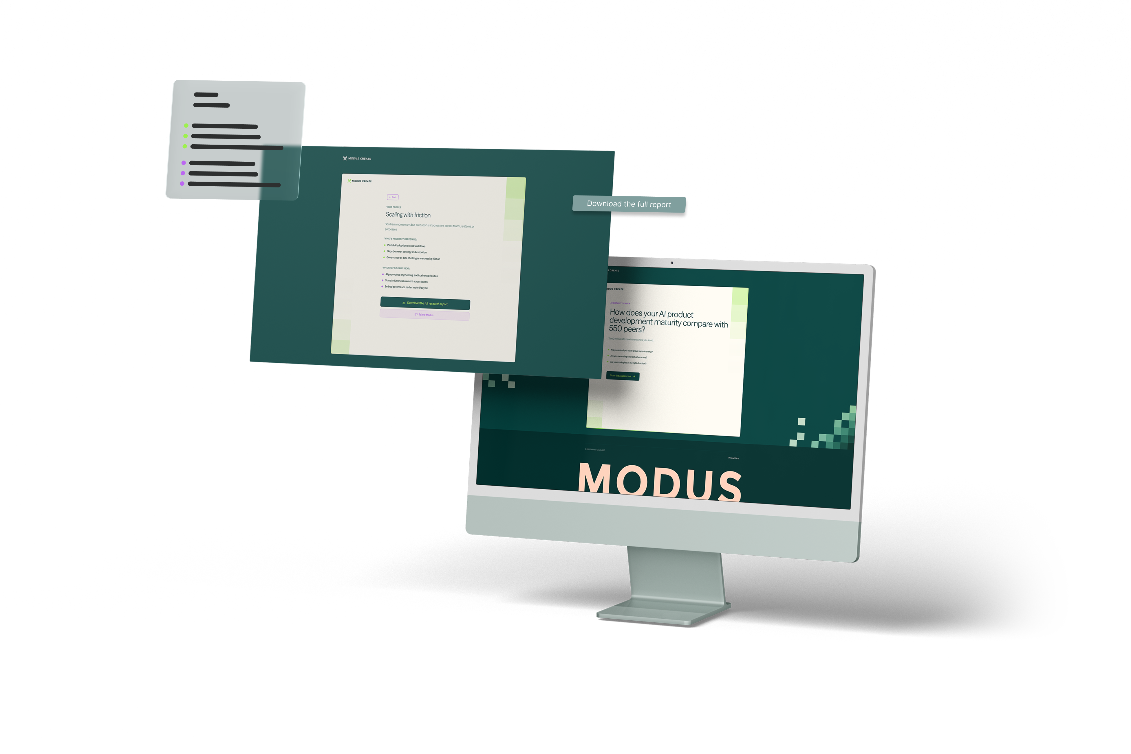
AI MATURITY CHECK
Compare your AI maturity with 550 peers
Take a two-minute assessment to see how your AI adoption compares with over 550 product development leaders.
LET'S GET STARTED
Talk to Modus Create
Big challenges need bold partners. Let’s talk about where you want to go — and start building the path to get there.